MicroDental Brand Refresh

Brand Identity • Typography • Motion • Print • Social

Context + role

The company had spent decades building trust as one of North America’s leading dental lab networks. Still, its visual language no longer reflected how the brand was evolving: more digital, more technology-forward, and speaking to a younger generation of practitioners.

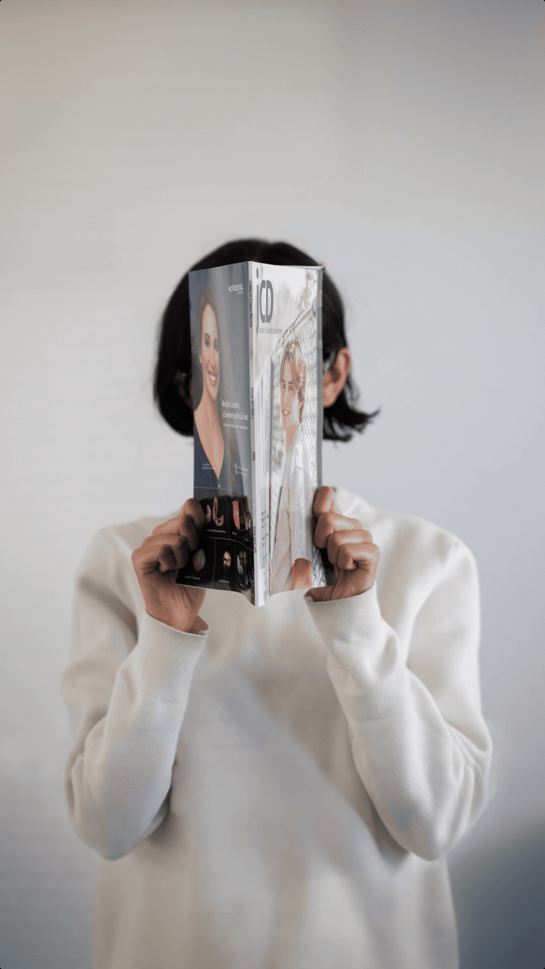
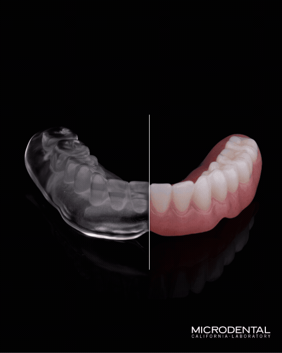
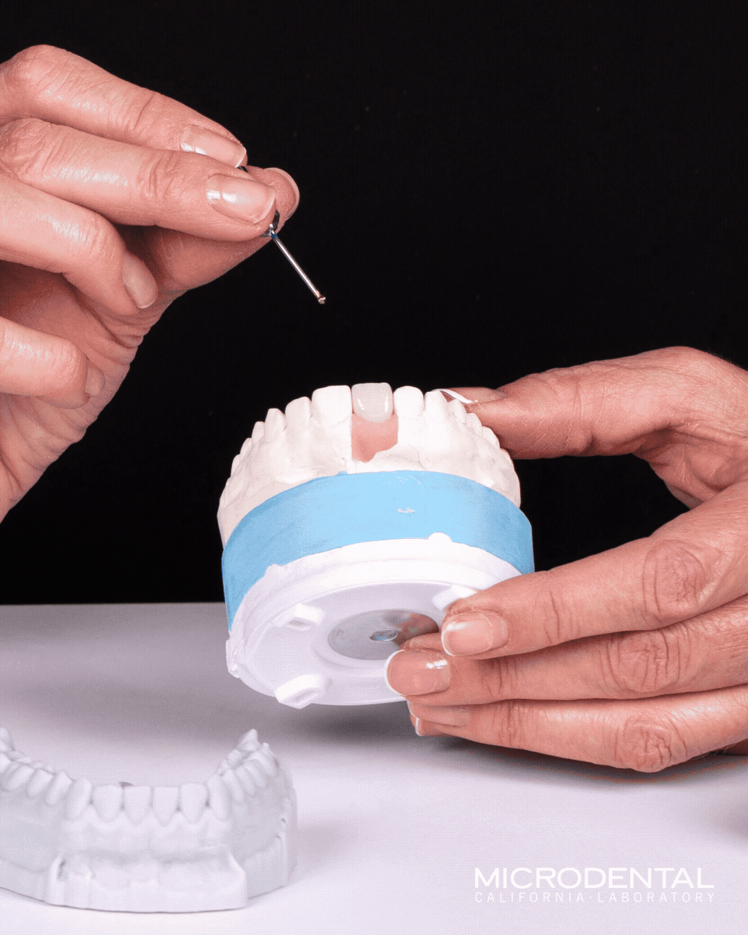
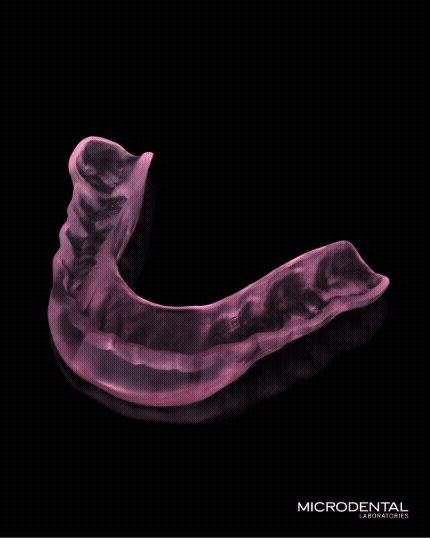
Instead of rebuilding the brand from scratch, I approached the refresh as a recalibration — refining the typography, color system, photography, and campaign direction across social, video, and print channels while preserving the credibility already in place.
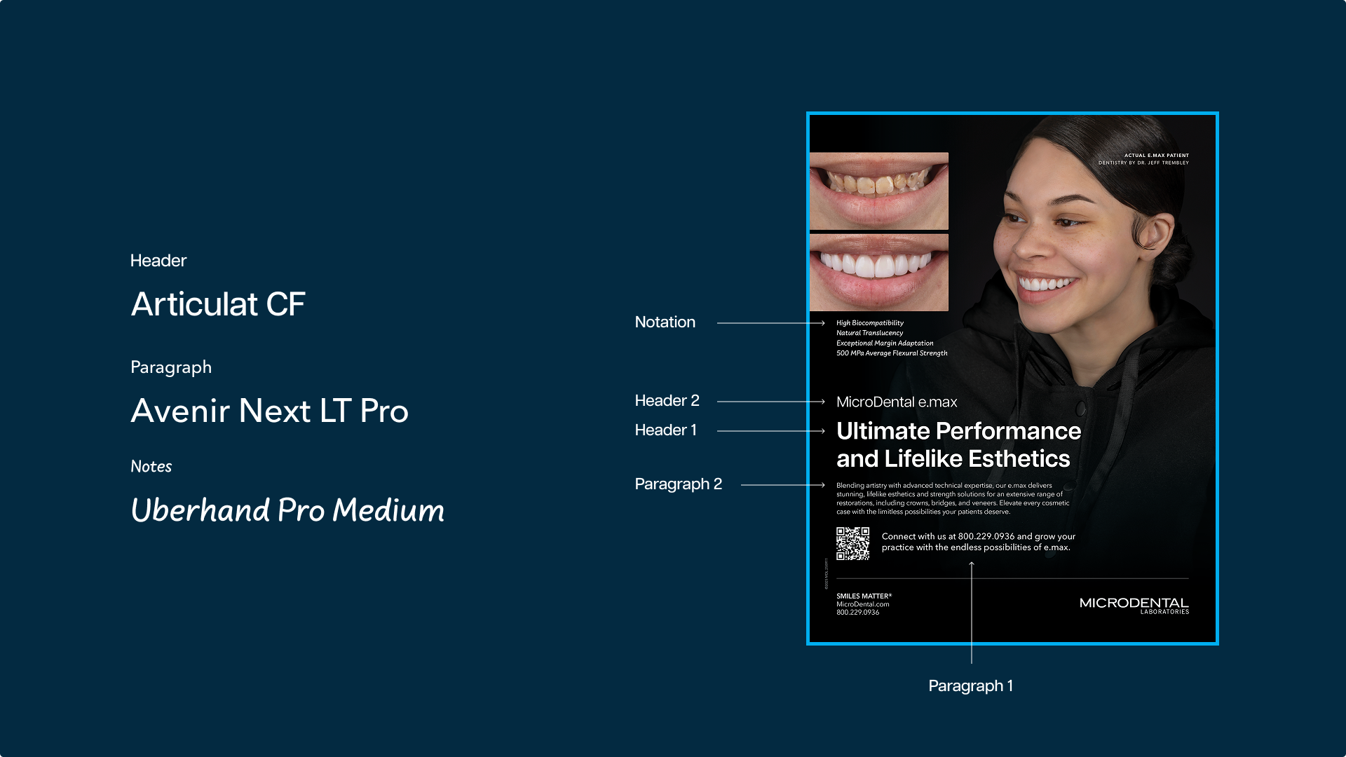
Typography

Color system

Reels

New print look

Social


Creative decisions

The biggest challenge was finding the balance between modern and credible. In healthcare, trust often lives in restraint — push too far toward trend-driven design and the brand risks losing the seriousness practitioners rely on.

The goal was never disruption, but evolution. Every decision came back to the same question: Does this still feel like MicroDental, just more current and adaptable?

One of the biggest shifts was introducing short-form video into the brand ecosystem. Since there was no existing motion language to build from, I developed the foundational system by defining typography movement, pacing, transitions, and compositional behaviors that could scale across future content.

The refreshed system was implemented across social, video, and print, creating a more cohesive and flexible brand presence across channels.

Next project