
MicroDental Brand Refresh
Brand Identity • Typography • Motion • Print • Social
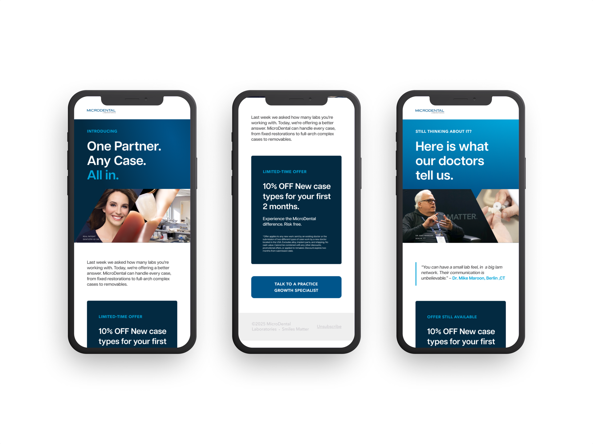
Context + roleThe company had spent decades building trust as one of North America’s leading dental lab networks. Still, its visual language no longer reflected how the brand was evolving: more digital, more technology-forward, and speaking to a younger generation of practitioners.
Instead of rebuilding the brand from scratch, I approached the refresh as a recalibration — refining the typography, color system, photography, and campaign direction across social, video, and print channels while preserving the credibility already in place.
The starting point
and where we took it.
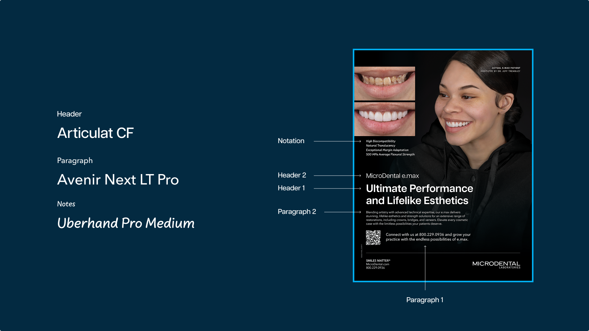
Typography
Color system
Reels
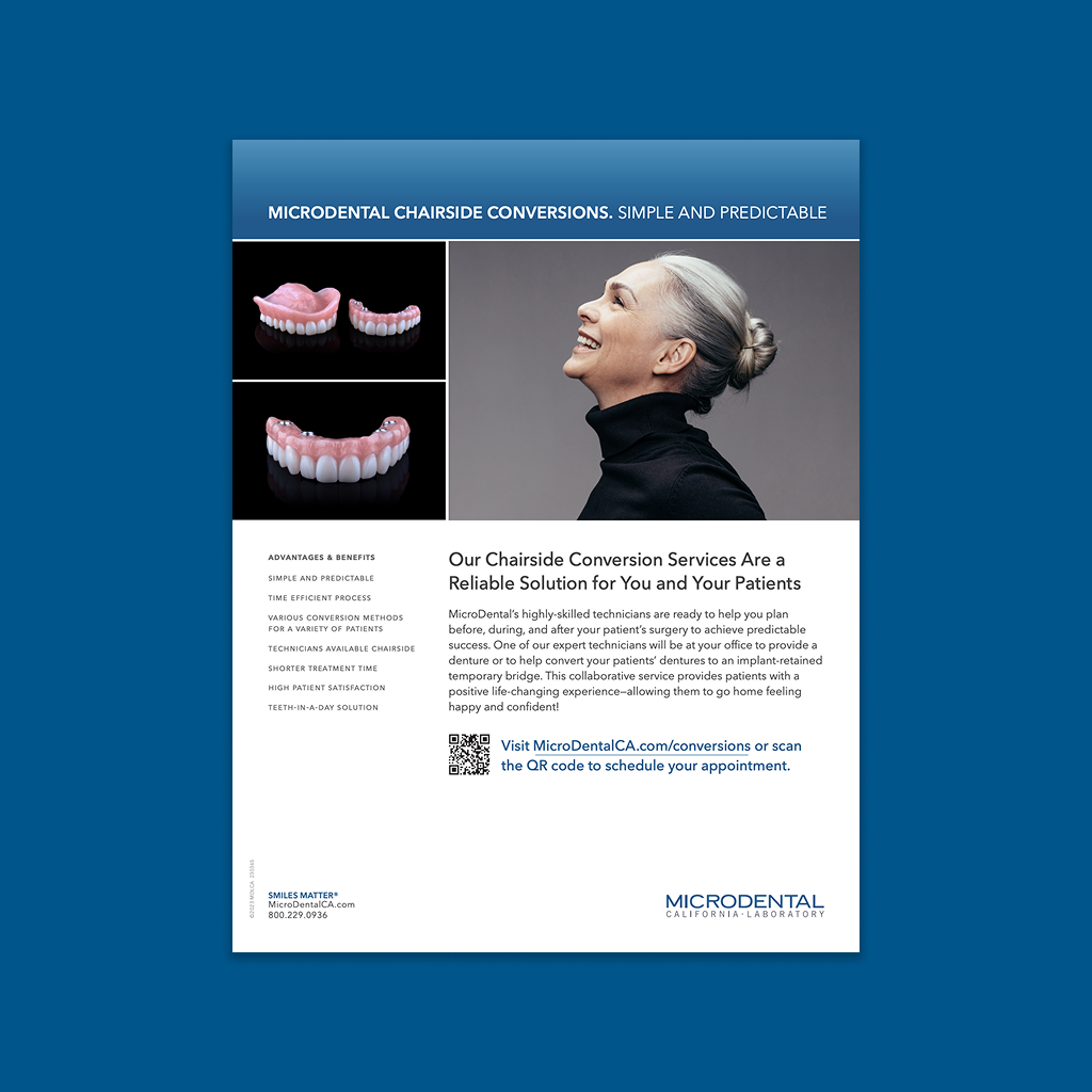
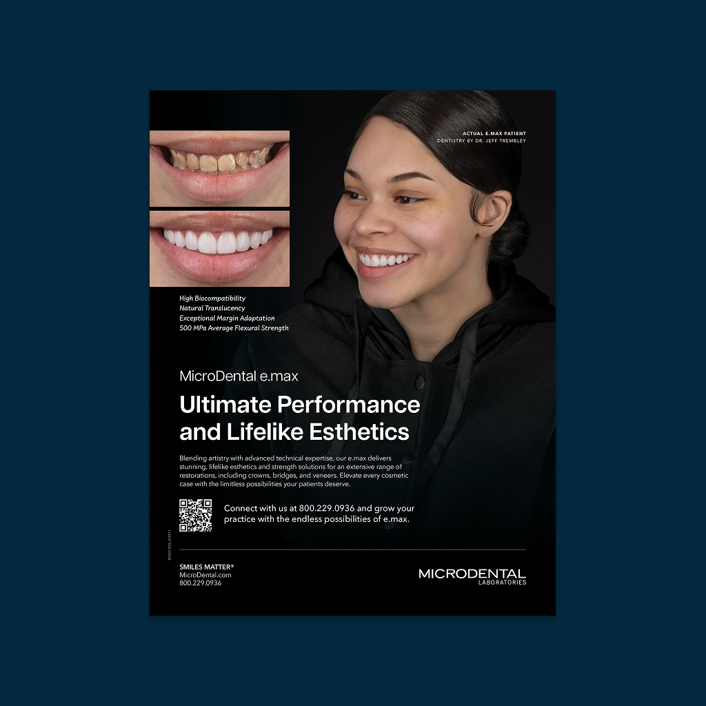
New print look
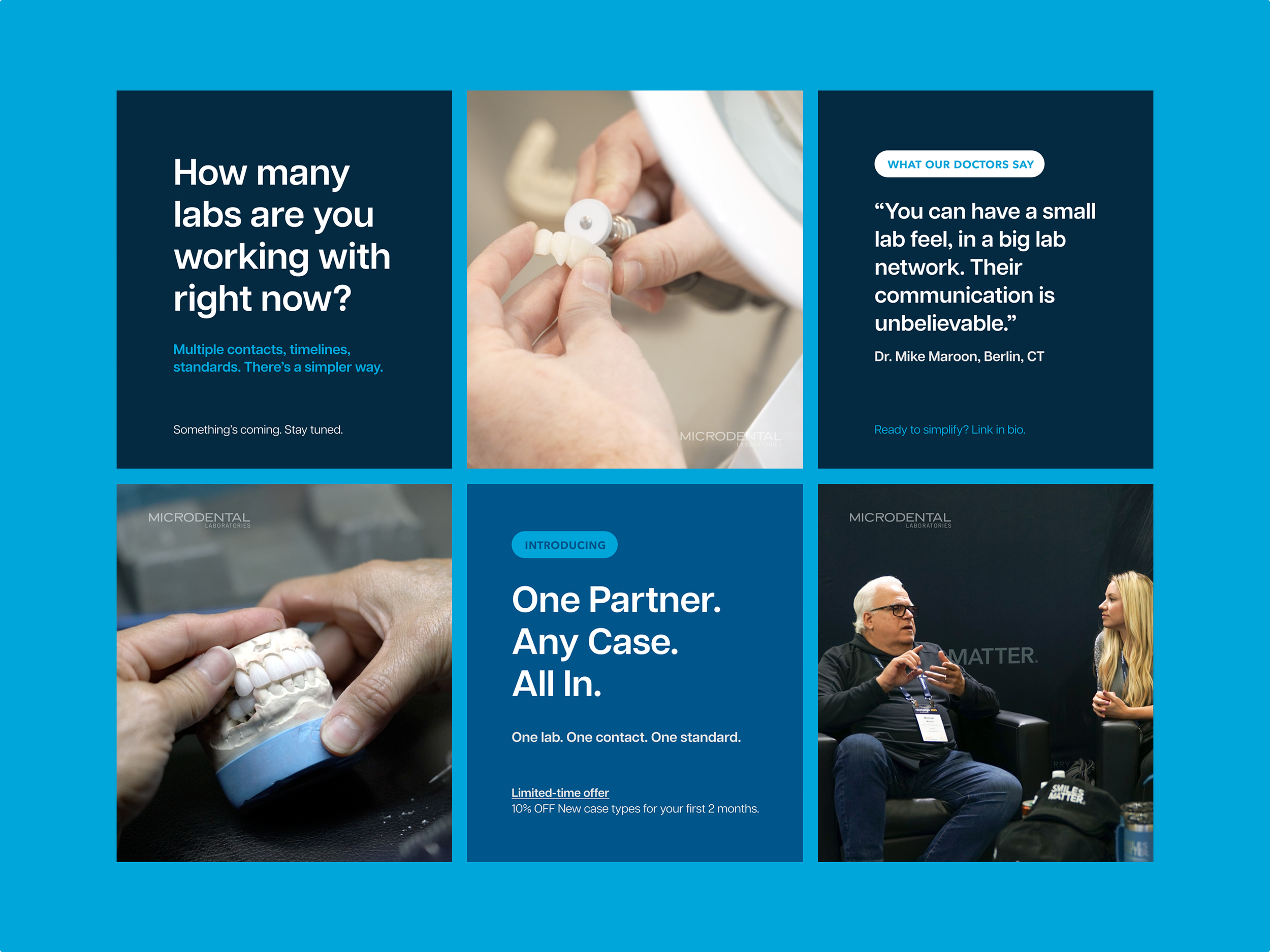
Social
Creative decisions